Taschen Site Visual Redesign
Taschen is a leading an art book publisher founded in 1980 by Benedikt Taschen in Cologne, Germany. The company has many retail store around the world. Taschen has published many iconic design/art books and collections, they have a strong influence in the design and art industry by offering premium books that are often seem more as collectibles.
However, their official website doesn’t convey any of the previously mentioned qualities. The following redesign is my take on how to transform a classic and iconic publishing house’ site to a more modern, interactive experience that showcases Taschen’s brand image as well as what it has to offer.
Industry: Publishing; e-commerce

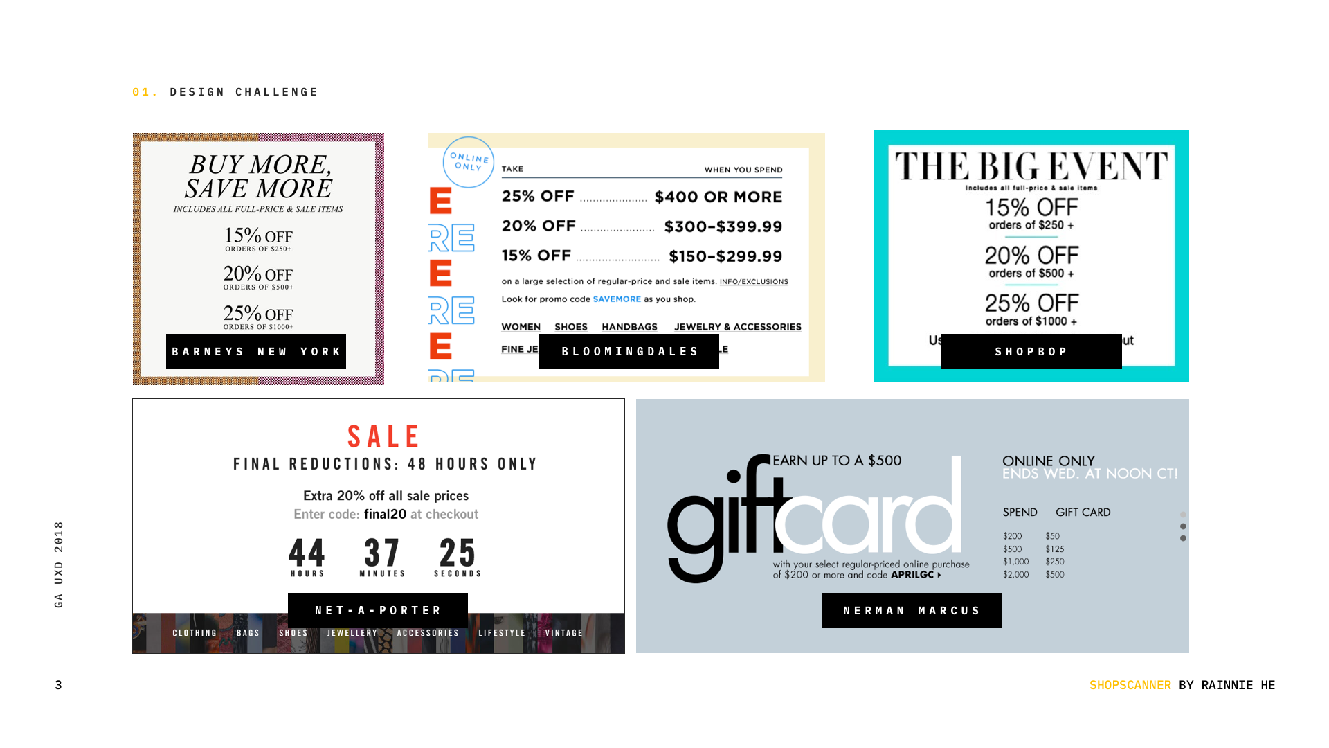
Problems
While the site doesn’t have any functionality glitch , it is very cut and dry, and it doesn’t resonate with the Taschen brand or retail image. The homepage serves as a “first impression”, but the hero image carousel is very messy, and depending on the background image, the text sometimes gets lost.

Approach
I wanted the site to be a place to showcase Taschen’s brand voice, and its offerings. They are one of the best art/design book publisher and the site should have a fresh and modern look and feel that compliments its content without taking away the spotlight of the actual books.
Chances are, the people who are on taschen.com are art/design enthusiast who are digital savvy. They don’t need too much guiding when they are browsing through each page. So I got rid of all the traditional navigation, and kept the homepage clean and minimal, with very little visual aids to guide users where each navigation is.
Persona
Based on in-person interviews conducted by me, potential users can be categorized into two personas.


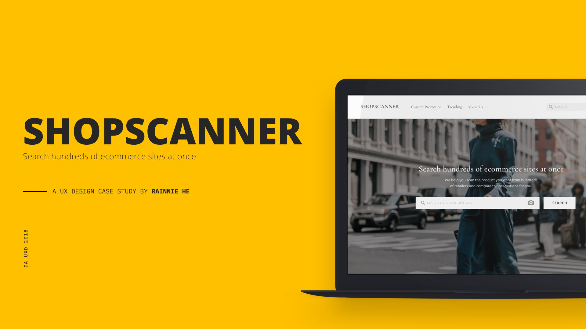
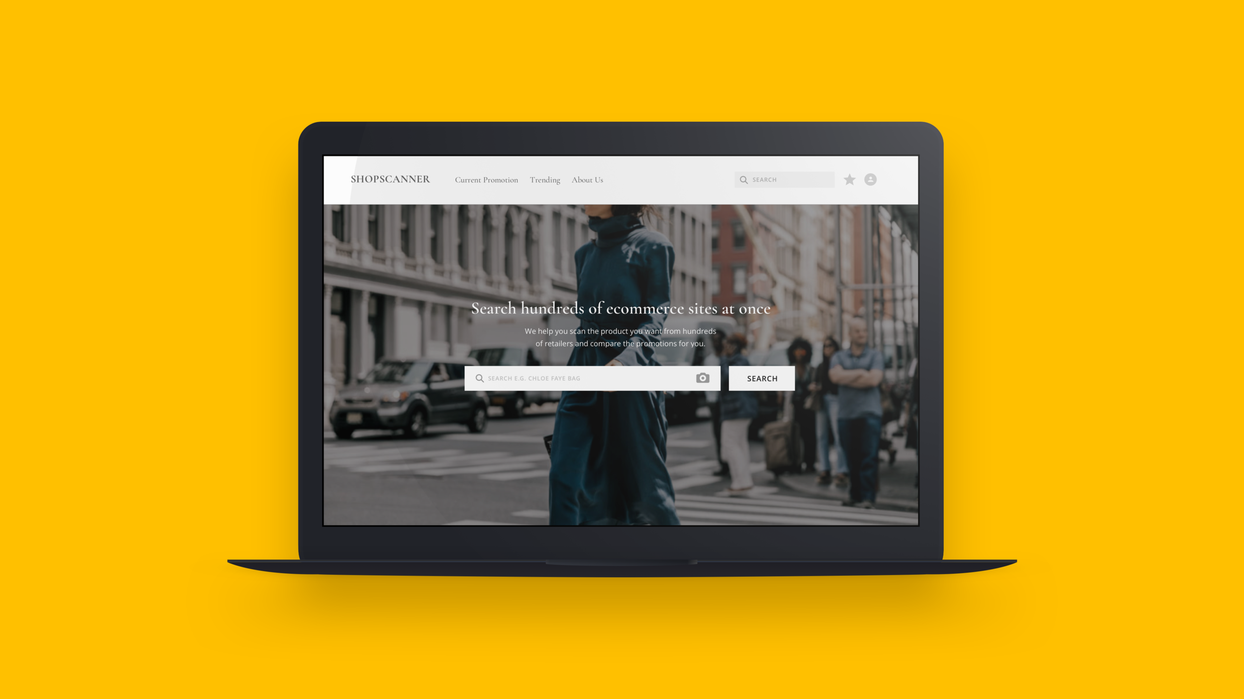
Solution: a site that allows shopper to compare prices of multiple retailer for a single item.
Site Map
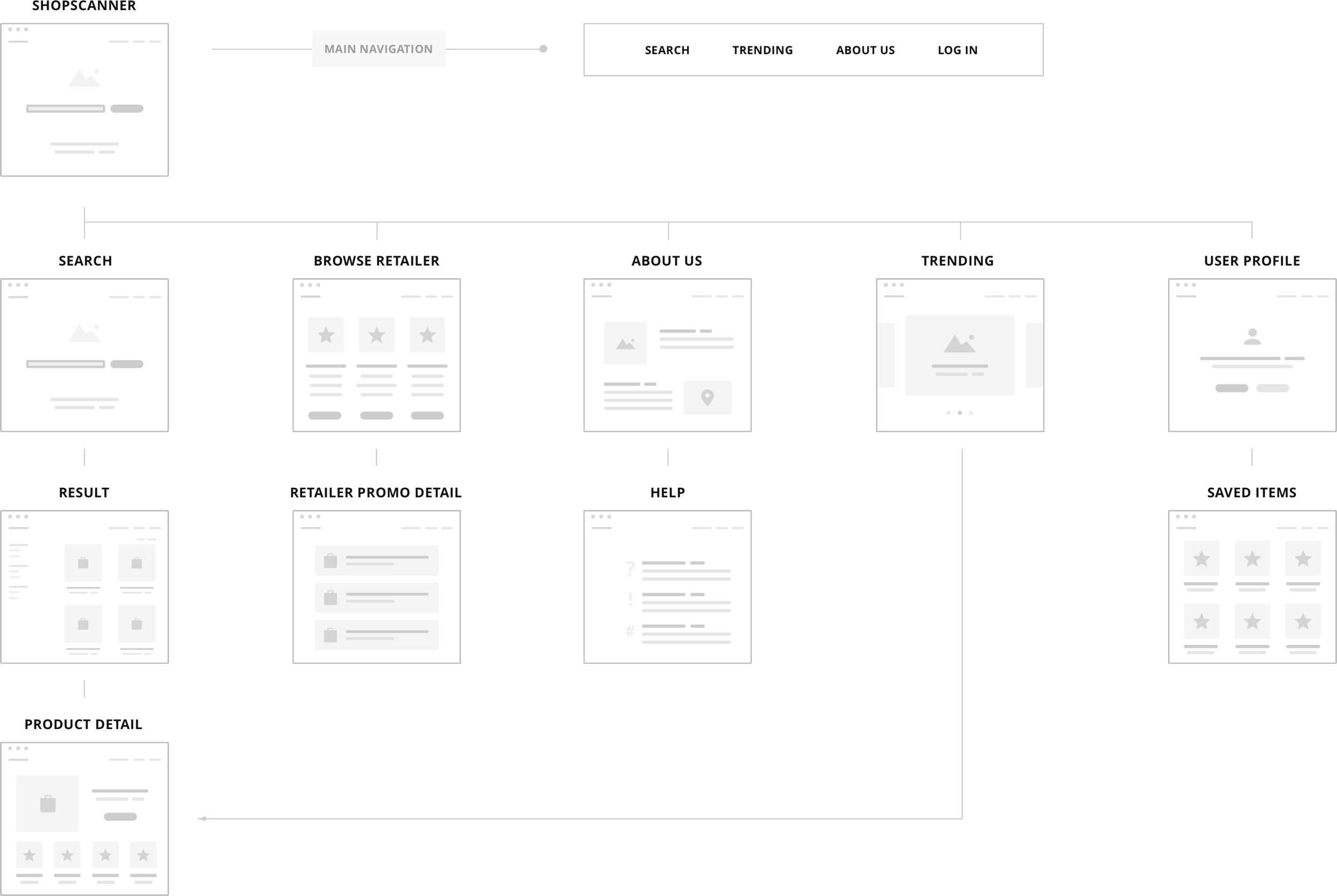
Main Workflow

Wireframes


User Testing Findings
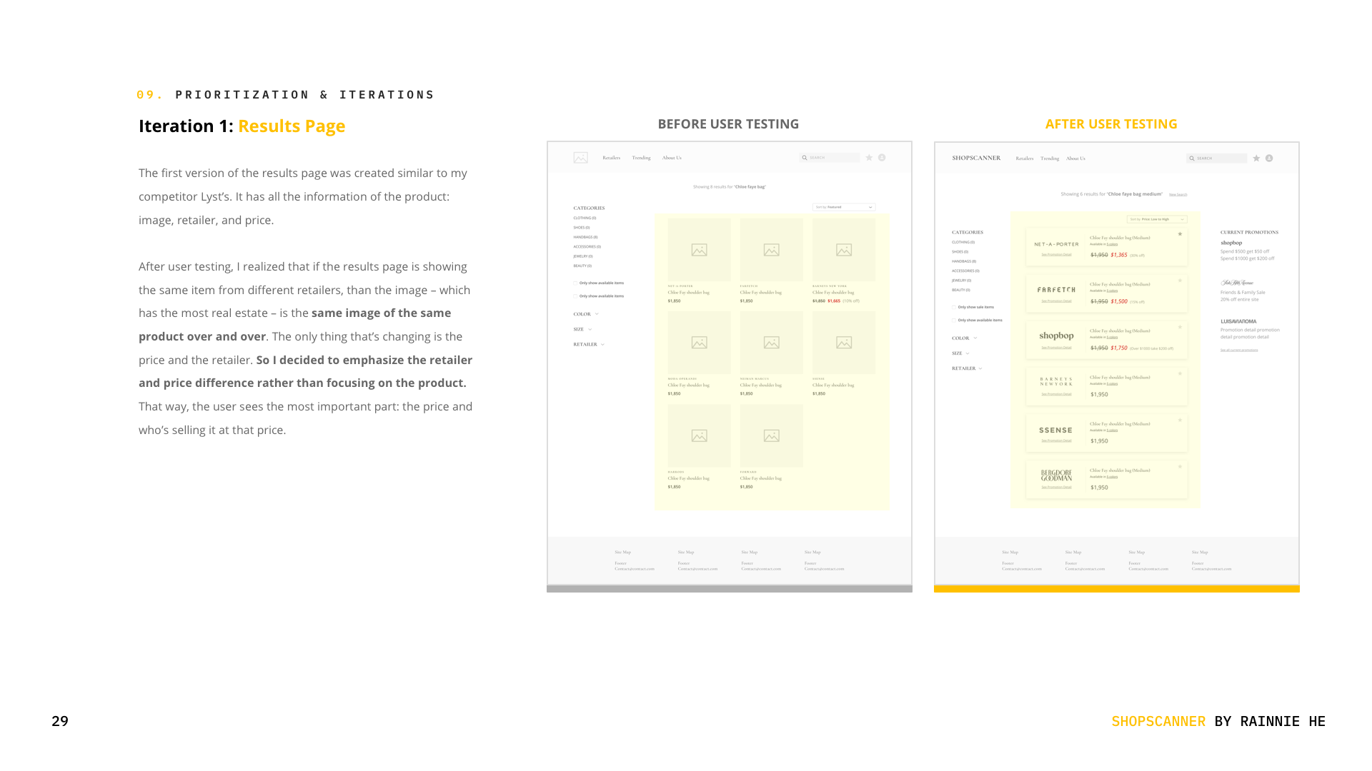
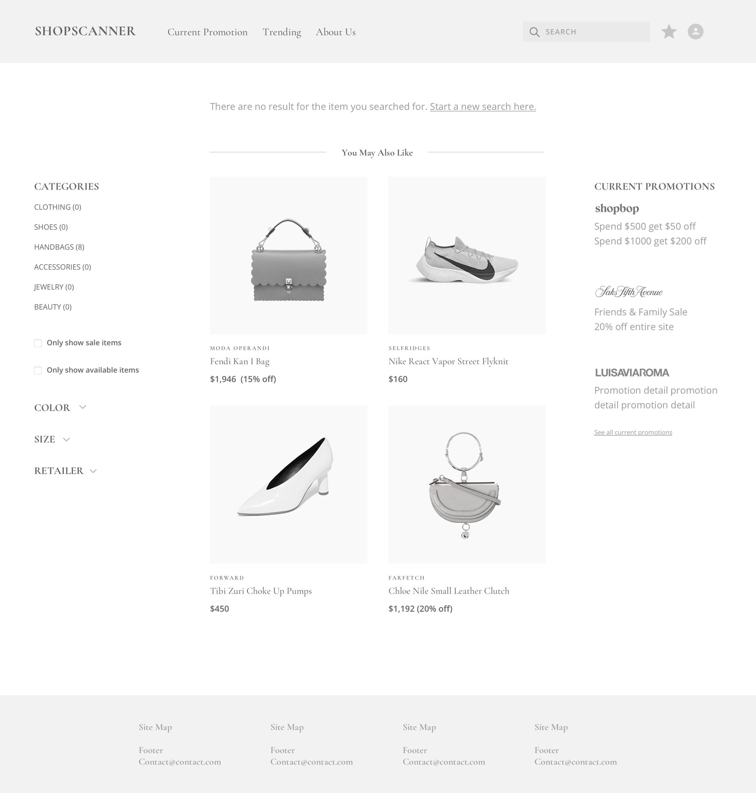
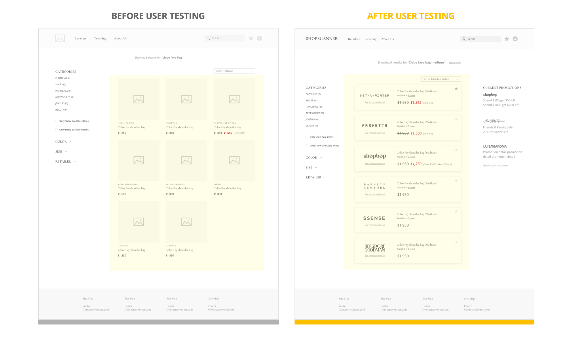
The first version of the results page was created similar to my competitor Lyst’s. It has all the information of the product: image, retailer, and price.
After user testing, I realized that if the results page is showing the same item from different retailers, than the image – which has the most real estate – is the same image of the same product over and over. The only thing that’s changing is the price and the retailer. So I decided to emphasize the retailer and price difference rather than focusing on the product. That way, the user sees the most important part: the price and who’s selling it at that price.
Results Page
Product Detail Page
I first started by doing a lot of research of how other retailers displayed their product page, and just threw all the necessary content onto the page, such were: product images, product name, brand name, color and size selection, and price.
However, after user testing, I found out that people’s intuition was to find the price comparison first, rather than seeing all the product details. Since comparing price is the main feature of my site, I decided to put the price chart on the top of the page, so that people see it right away.
Additionally, I added indicator for when the sale is ending next to the price, so if the sale is ending soon, it might affect whether the user wants to save for later or buy now.

Usability Testing Findings
User Testing And Valuable Feedback
User testing helped me gained insights on how the users think and what they expect to happen next. For example, after they typed something in the search box, chances are they already know what they’re looking for and what the product looks like, so the next thing they expect to see, on this site, is the prices of different retailers selling this product. Without user testing, I would have probably buried this most important piece of the product to somewhere not as prominent. The product can only improve when the designer is constantly listening to user feedback and constantly making iterations.
It’s More Of A Tool Than A Shopping Site
At first, my direction for the entire site was to have a shopping site experience, so I designed the content in a traditional e-commerce way. After user testing, I realized that this is more of a tool that helps people shop, rather than a shopping site itself. This breakthrough helped me pivoted design it like an flight finder. I used this concept and research some indirect competitors such as Kayak, Expedia and Priceline.
The Complete UX Case Study